
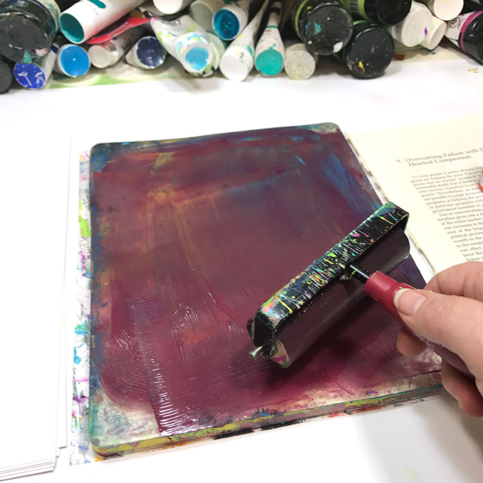
Color is a huge factor when making gel prints. If you love the colors, you are more likely to love your prints so our first lesson is all about understanding how colors mix and play together. We’re going to start out by making Mud. Yes, ugly yucky mud. It is worthwhile to know how to make it because if you know how to make it, then you know how to avoid it!
Video #1 Color theory overwhelmed me when I started playing and all the official terms were impossible for me to remember, let alone apply. But with my love of the rainbow and dislike of brown, I had to find a way to befriend the color wheel. So I did with a silly story of BFF’s (best friends forever) and Frenemies.
Video password:gelprinting
Watch/Download on Vimeo. Need help downloading or with other technology issues? Check out the technical help page here.
To download and print out the BFF & Frenemy color wheel, just right click on it, then select save image as to choose where on your computer you want to save it.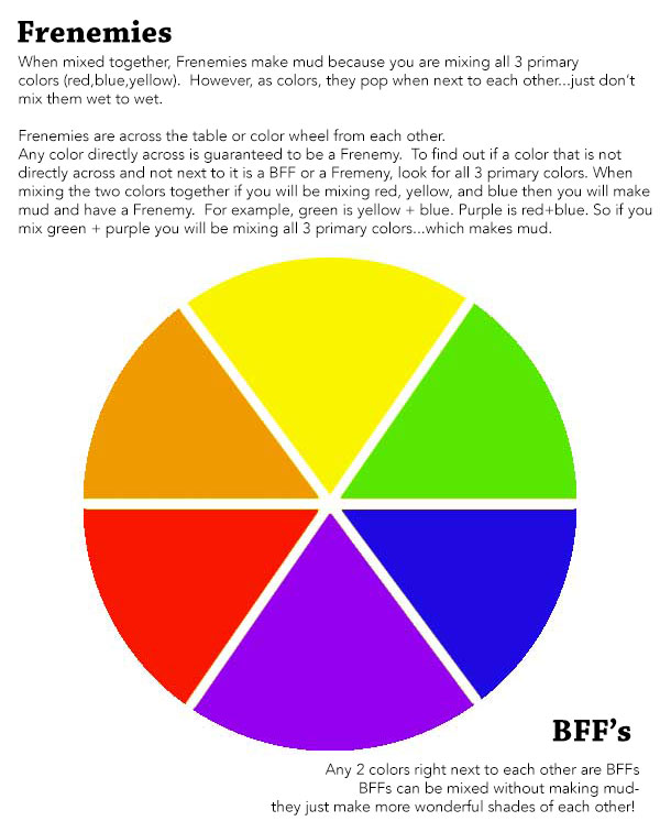
Let’s see these BFF’s and Frenemies in action making prints.
Video password:gelprinting
Watch/Download on Vimeo. Need help downloading or with other technology issues? Check out the technical help page here.
More BFF play to create prints and see how differing amounts of paint can make a huge impact on the final print.
Video password:gelprinting
Watch/Download on Vimeo. Need help downloading or with other technology issues? Check out the technical help page here.
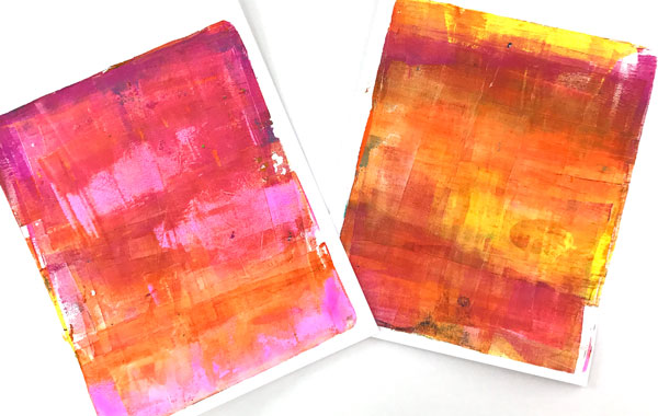
Fluid paints mix together more easily because they are runnier. But even as much as I mixed these, when you take the pulls, you can see that they weren’t completely mixed through and through. There are layers of color in there.
Why was my mud so red? Because I had a lot more red pigment compared to the other colors. It didn’t look like a big difference when I put the paint on the plate, but it clearly was based on the print.
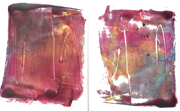
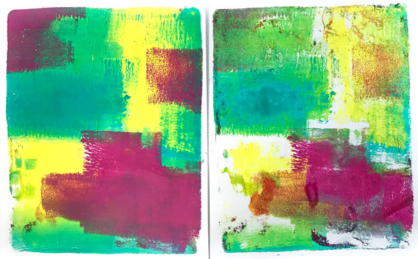
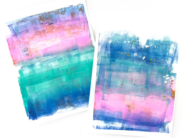
These are the prints made with the fluid, or runny, paints. The edges are wavy and varied because fluid paints run and don’t hold their shape the way a heavy body paint does.
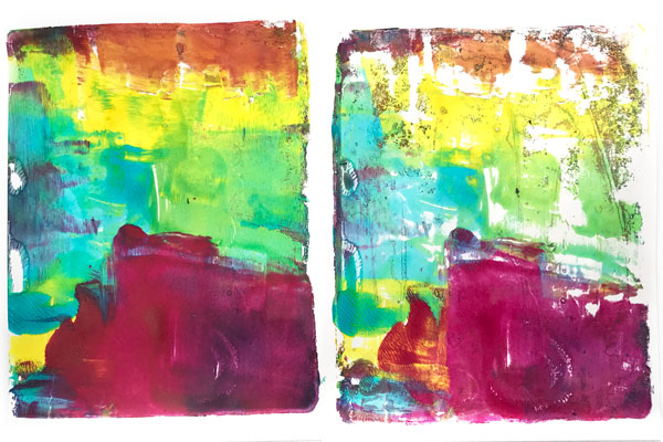
Here are the prints made with the heavy body paints. The edges of each color are more linear, because heavy body paint stays where you put it.
Tips to keep your colors bright or pure:
- Start with your lightest color first.
- Clean the brayer off on a scrap of paper after each color
Using only BFF colors when doing thin layers or lots of brayering (all of which impact the look of a print) means you can mix away and not create mud.
Now it is your turn to play! Grab a red, a blue, and a yellow and make some mud! Get a feeling for how much brayering it takes to make your paints go to mud.
Then clean off your brayer with something like a baby wipe, and use the same 3 colors but this time, use the BFF’s and Frenemies to guide you to avoid making mud.
- Fluid paints mix together more easily because they are runnier.
- When using heavy body paints, Frenemies can be layered gently on top without making mud.
Looking forward to seeing your prints in the Facebook group!
Supplies used in this lesson:
DecoArt Fluid acrylics: Hansa Yellow Light, Quinacridone Magenta, Cobalt Teal Hue,
Liquitex Heavy Body: Cobalt Teal, Yellow Light Hansa, Medium Magenta
Paper:90lb paper, a light cardstock at Amazon.
8×10 gel plates: Gel Press Plates at Amazon Gel Press Plates at DickBlick
brayer: at Amazon at DickBlick
You can find all the supplies in used in all the lesson here.